MCC’s primary request was for a detailed audit of their existing site, looking for usability issues, visual cohesion, and areas for an improved user experience. I began with an inspection of every page on the site, checking for formatting, readability, consistent text styles and brand voice, and responsiveness between desktop and mobile breakpoints. In this initial survey, I made the following recommendations:
Next, I tested the user journeys provided by the business to check for usability, pain points, and any buttons or links with missing connections and found the following:
Next, I tested the user journeys provided by the business to check for usability, pain points, and any buttons or links with missing connections and found the following:
MCC’s primary request was for a detailed audit of their existing site, looking for usability issues, visual cohesion, and areas for an improved user experience. I began with an inspection of every page on the site, checking for formatting, readability, consistent text styles and brand voice, and responsiveness between desktop and mobile breakpoints. In this initial survey, I made the following recommendations:
Add an overlay to the hero image on the homepage so that the text on top is readable
Add a favicon so that the site is distinguishable between window tabs
Decide on and apply cohesive pronouns when referring to the business (I/me vs we/us) to avoid confusing users
Add links for each page to the site footer
Add links for each page to the site footer
Consider replacing stock images with photographs that better reflect the warm, friendly voice used in the copy
Re-imagine the layout for the services page so that the service name, description, and “book now” button are more clearly grouped
An underlined link on the “Book Now” page was missing a connection
The links on the error page were not underlined, so it was unclear that they were clickable
The top navigation bar was not sticky, causing users to have to scroll all the way back to the top of the page for navigation
The “Learn More” button for the unfinished virtual course led to an error page, leaving users with no information on what to expect or look forward to
Next, I tested the user journeys provided by the business to check for usability, pain points, and any buttons or links with missing connections and found the following:
Please check back in soon to see more of this project's process and results. Updates are made daily!
In the meantime, check out one of my other projects below!
Please check back in soon to see more of this project's process and results. Updates are made daily!
In the meantime, check out one of my other projects below!
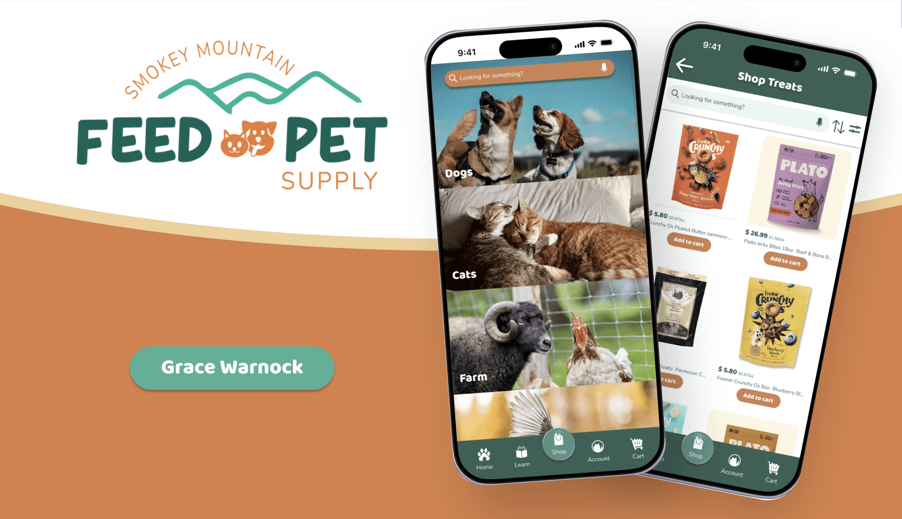
Smokey Mountain
Feed & Pet Supply
A shopping app for a small business pet feed store.
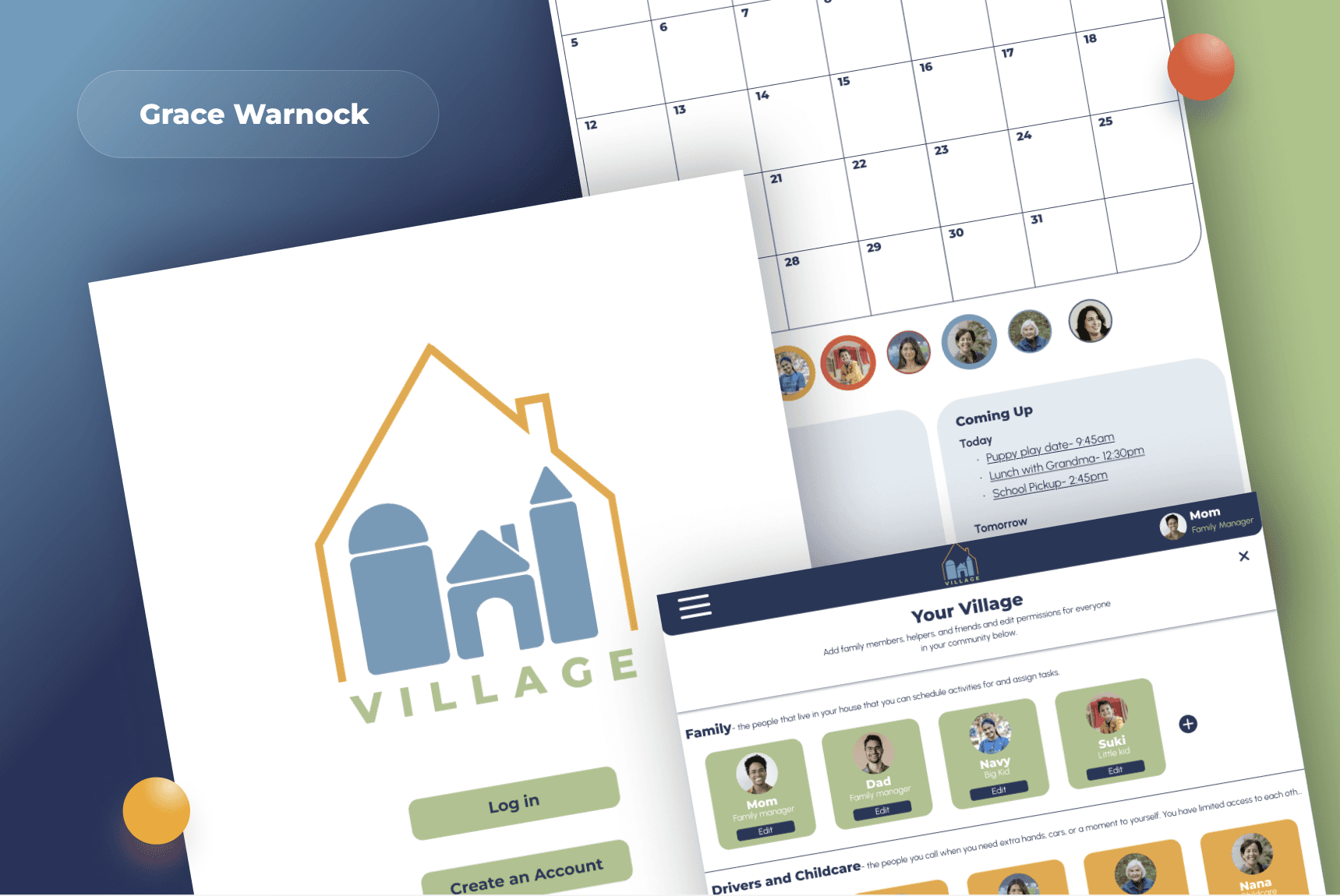
Village Website
A responsive website for family schedule management.
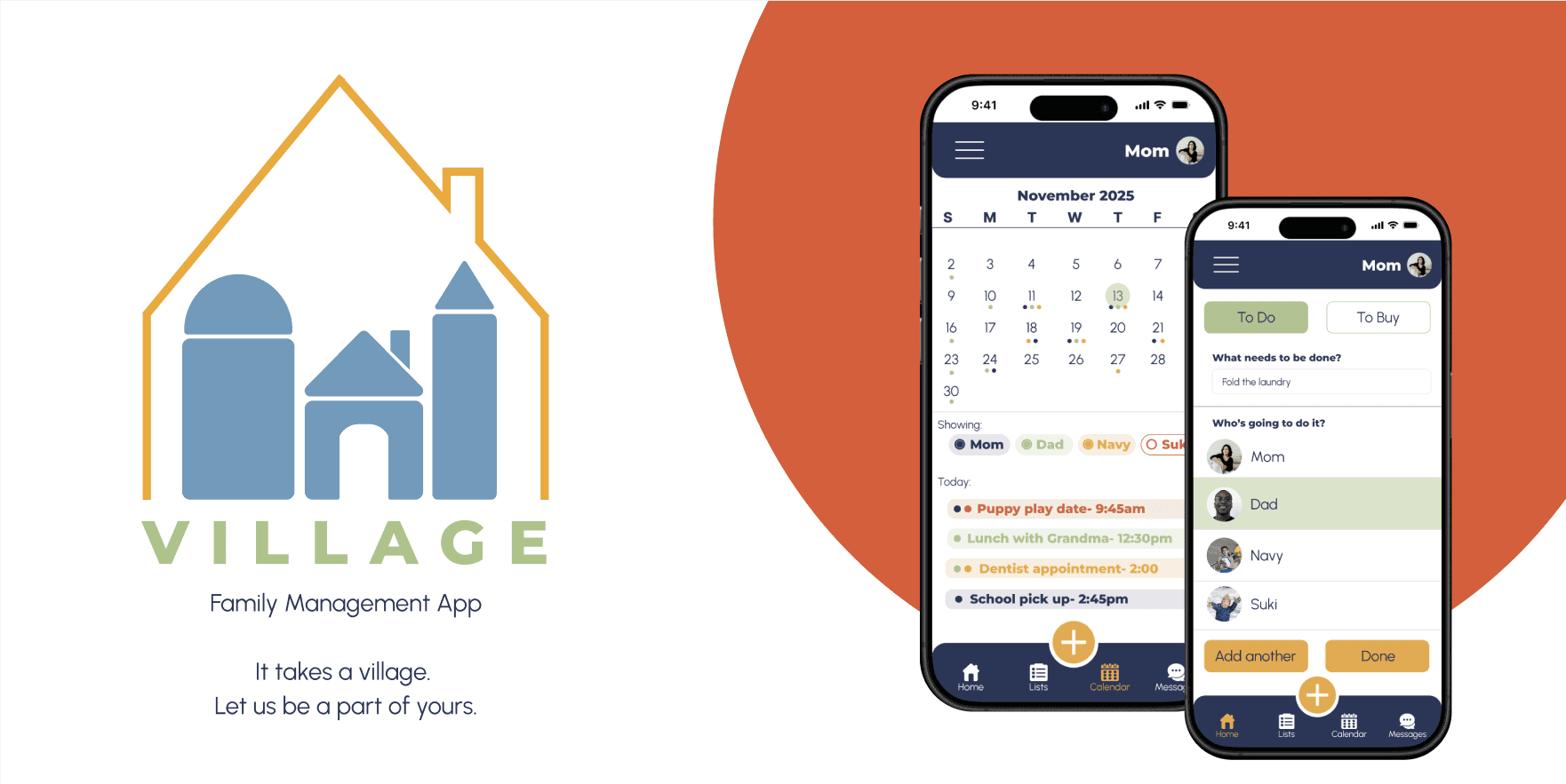
Village App
A mobile app for family schedule management.
Smokey Mountain
Feed & Pet Supply
A shopping app for a small business pet feed store.
Village Website
A responsive website for family schedule management.
Village App
A mobile app for family schedule management.
Smokey Mountain
Feed & Pet Supply
A shopping app for a small business pet feed store.
Village Website
A responsive website for family schedule management.
Village App
A mobile app for family schedule management.